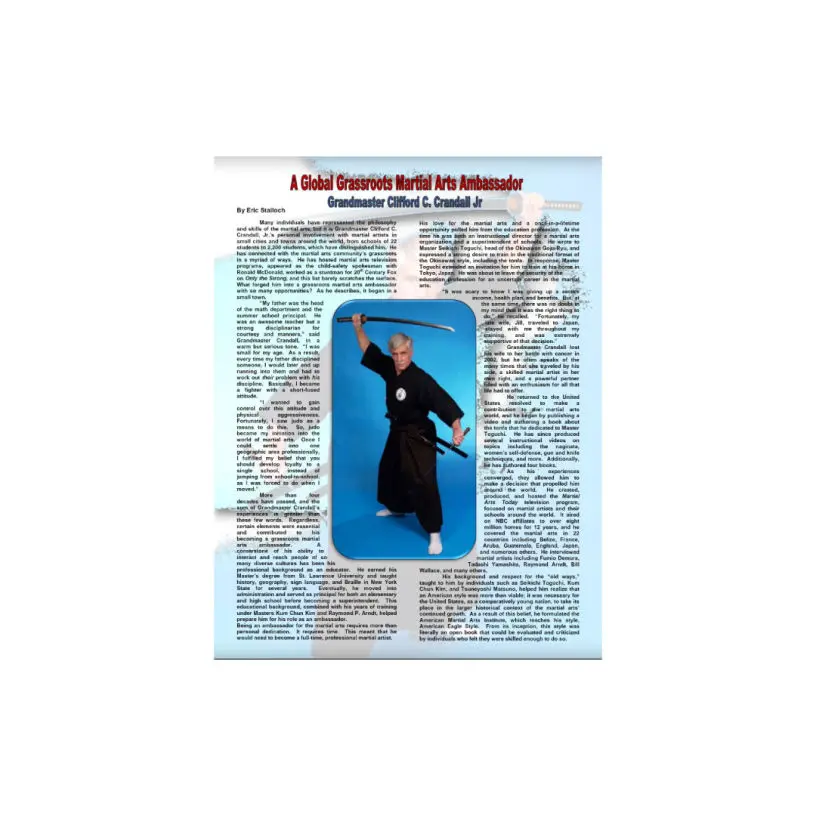
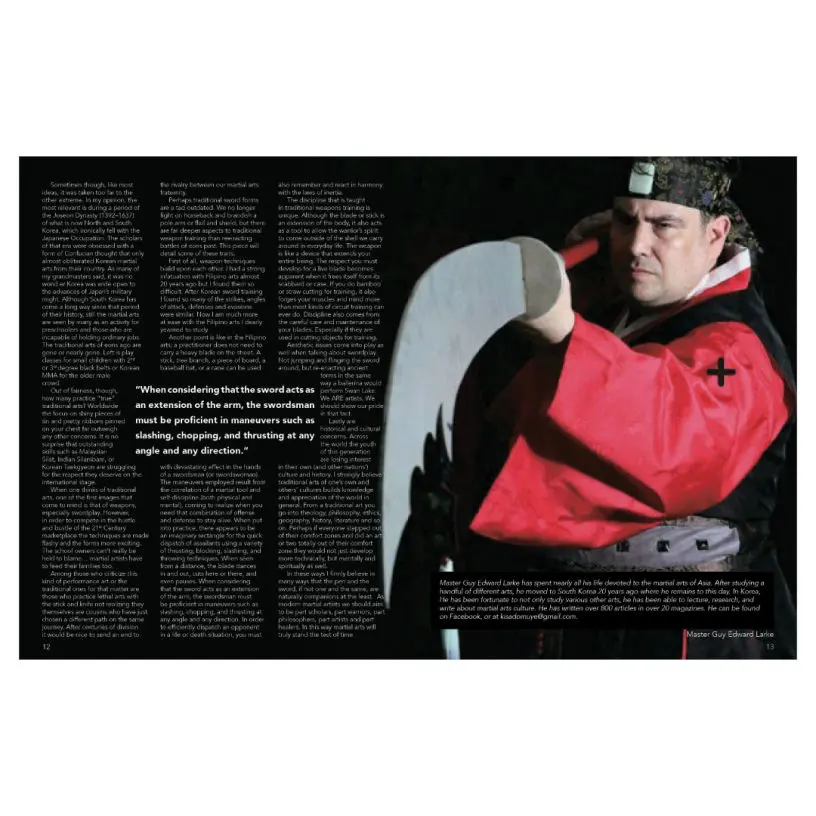
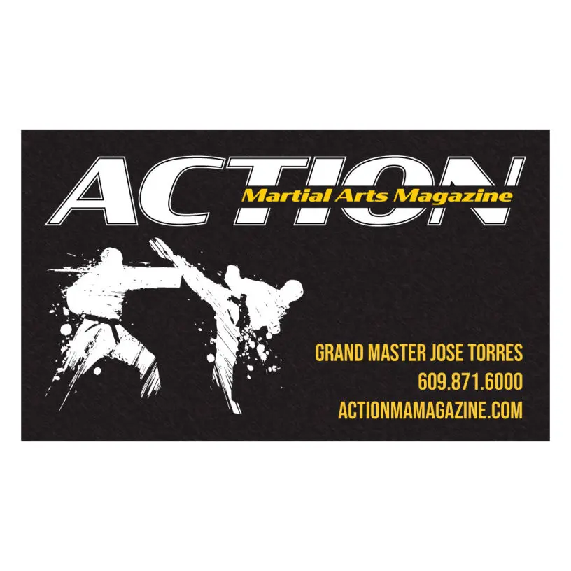
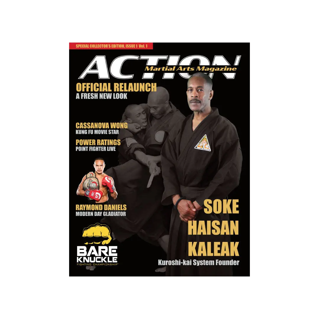
A full color martial arts magazine with a world wide reader subscription. The client asked to rebrand this late 90's magazine from the ground up to give it a new and improved look.
This was my opportunity to:
Make a new logo for the brand. The old logo was very dated and does not stand up to the logo esthetics of today.
Give the magazine a complete design overhaul. From the use of grids and alignment, to font and color, the magazine will compete with today's magazine standards.
Create brand merchandise. Go a step further to promotional giveaways such as mouse pads, calendars, pens, t-shirts, and more.
Old Magazine
The former magazine is dated and does not have a timeless design. The cover uses no grid system and the layout is visually questionable.
Old Logo
Old Magazine Cover
Old Layout
New Magazine
The logo uses a solid color. The cover is in alignment. The layout uses a grid system.
New Action Logo
New Action Cover
New Page Layout
Action Assets
These new additions to the brand help increase brand recognition.